Vital Signs for Telehealth
Project type
Interviews, usability studies, 3D prototyping, paper prototyping
Role
Lead UX Researcher and Designer
Date
January 2021 - September 2022
Description
While working at the Ubiquitous Computing Lab at the University of Washington, I researched and improved the user experience for smartphone-based vital signs measurements. I led a team to address usability challenges, conducted interviews, developed insights through affinity diagramming, created prototypes encompassing mobile interfaces and physical models of assistive devices, and conducted think-aloud usability tests.
The Problem
Telehealth offers expanded treatment opportunities, but taking vital signs during remote visits is challenging. The Ubiquitous Computing Lab's health measurement apps provide a potential solution for capturing vitals like heart rate and blood oxygen levels. However, these apps face usability issues, mainly due to novel and unintuitive physical interactions with smartphones, potentially leading to incorrect usage and inaccurate measurements.
I led a team of four individuals, guiding them through in-depth phases of research, ideation, and user studies. Our mission was to unlock the full potential of vital sign capture during telehealth consultations by tackling user experience challenges within heart rate and breathing rate apps.
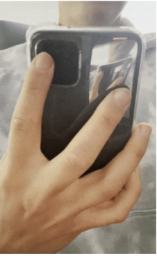
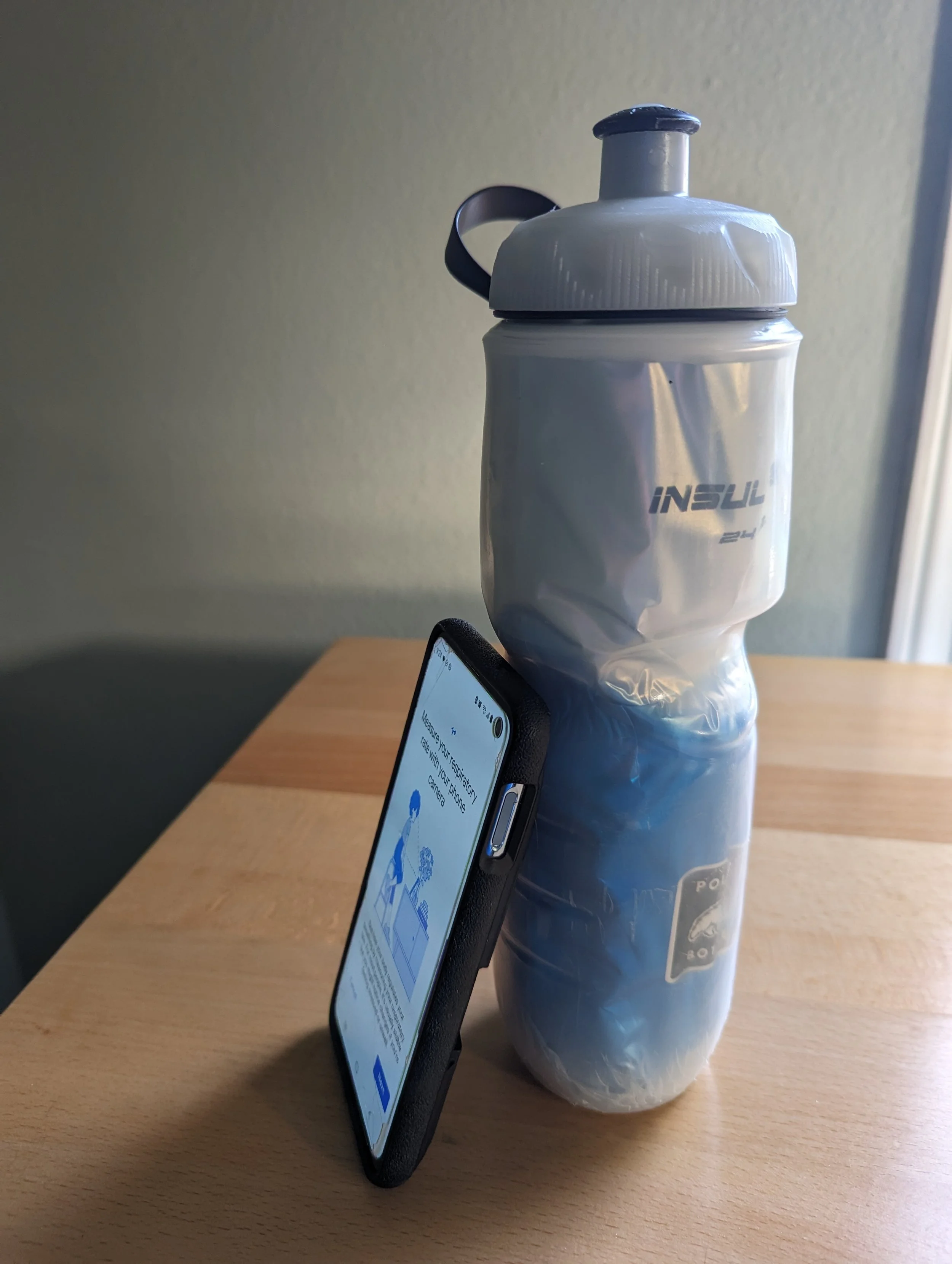
Left: A user takes their heart rate with their finger on the back of the phone. Right: A user resorts to using a water bottle as their makeshift phone stand for tracking their breathing rate.
Observations and Interviews
In order to gain insights into the telehealth environment, direct observations of patient interactions were essential. However, due to the sensitive nature of doctor's visits, we couldn't disrupt the consultations with observer questions, thus ruling out contextual interviews as an option. Instead, we conducted unobtrusive observations during wellness appointments with the consent of both providers and patients. Subsequently, we engaged in interviews with three physicians to ascertain their specific requirements during checkups.
“[Telehealth] is convenient when I’m working. I can ‘pop in’ then go back to work”
Affinity Diagram
We used affinity diagramming to analyze the data from our observatory sessions and interviews. We put each individual observation and quote on a digital post-it and clustered them to derive themes.
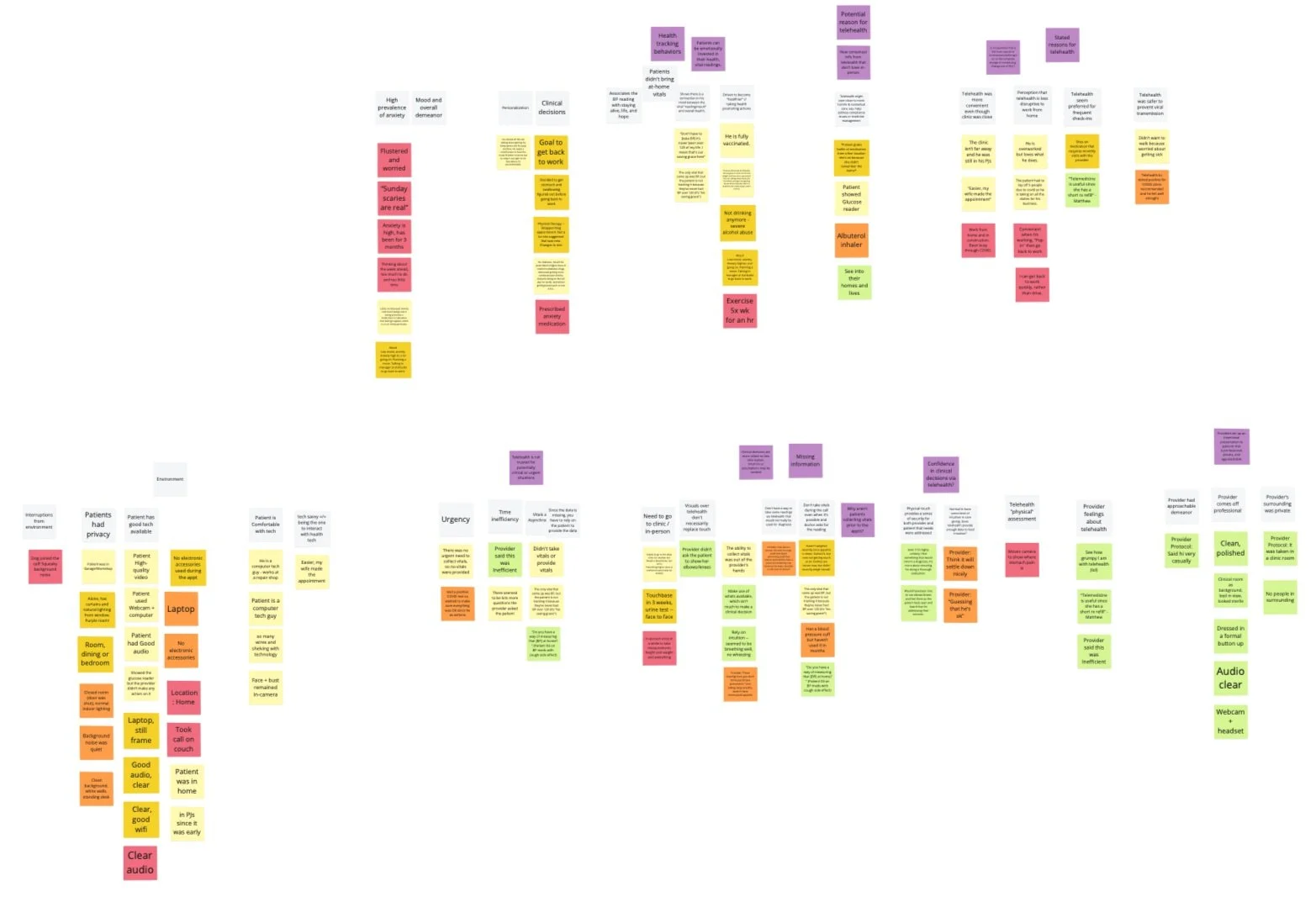
An affinity diagram of the observations and quotes we extracted from our observatory sessions and interviews.
Research Findings
We consolidated the insights gathered from our observations and interviews into a single list. The key insight derived from this synthesis was that capturing vital signs during telehealth visits could mitigate the information gap inherent in remote consultations.
Providers rely on limited information during telehealth consultations, using intuition and assumptions for clinical decisions.
Telehealth provides new opportunities for holistic contextual care, especially in compliance and medicine management.
Patients often have a deep emotional investment in their vital readings.
Providers consciously project a professional, private, and approachable image to patients during telehealth visits.
Personas
Leveraging our research, we crafted personas to serve as comprehensive user representations, enabling us to maintain a user-centric focus during the design process. In conjunction, we created scenarios for each persona, facilitating the exploration of practical usage scenarios as part of our design workflow.
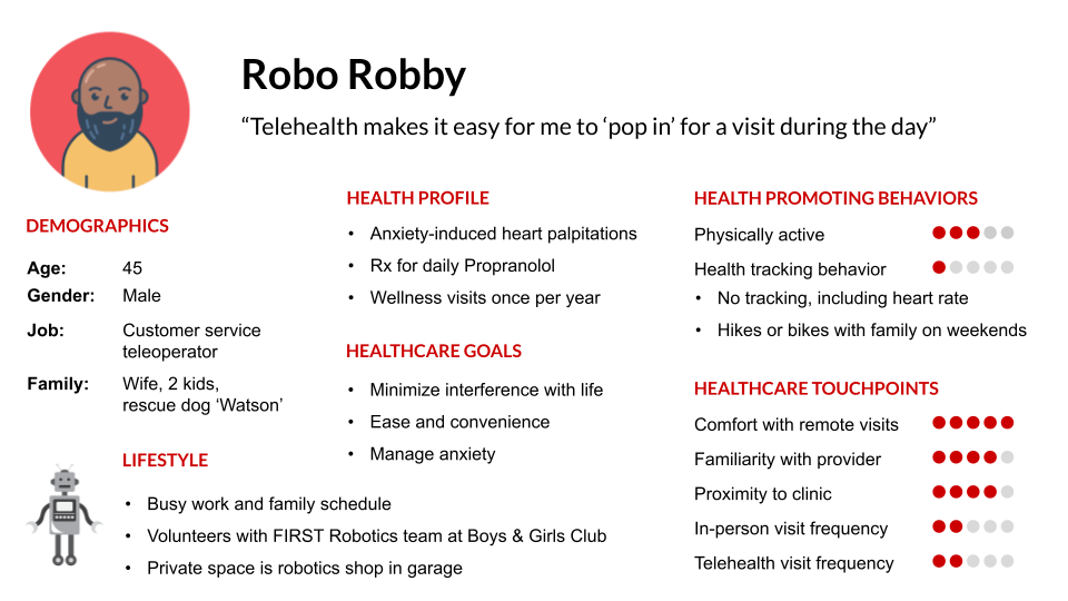
The persona above is representative of several of the patients that we observed during doctor visits. Click on it to see the other personas and their scenarios.
3D Prototyping
One of the biggest challenges in the ideation and design phase was addressing the unique interactions required by various health measurement apps. For instance, the necessity of placing one's finger over the camera to measure heart rate often led to issues related to users' unfamiliarity with the camera's location on their phone. To tackle this challenge, we rapidly prototyped multiple assistive devices aimed at helping users precisely locate and stabilize their finger over the camera. Our prototyping methods encompassed 3D printing, clay, and cardboard across nearly 20 different exploratory models.
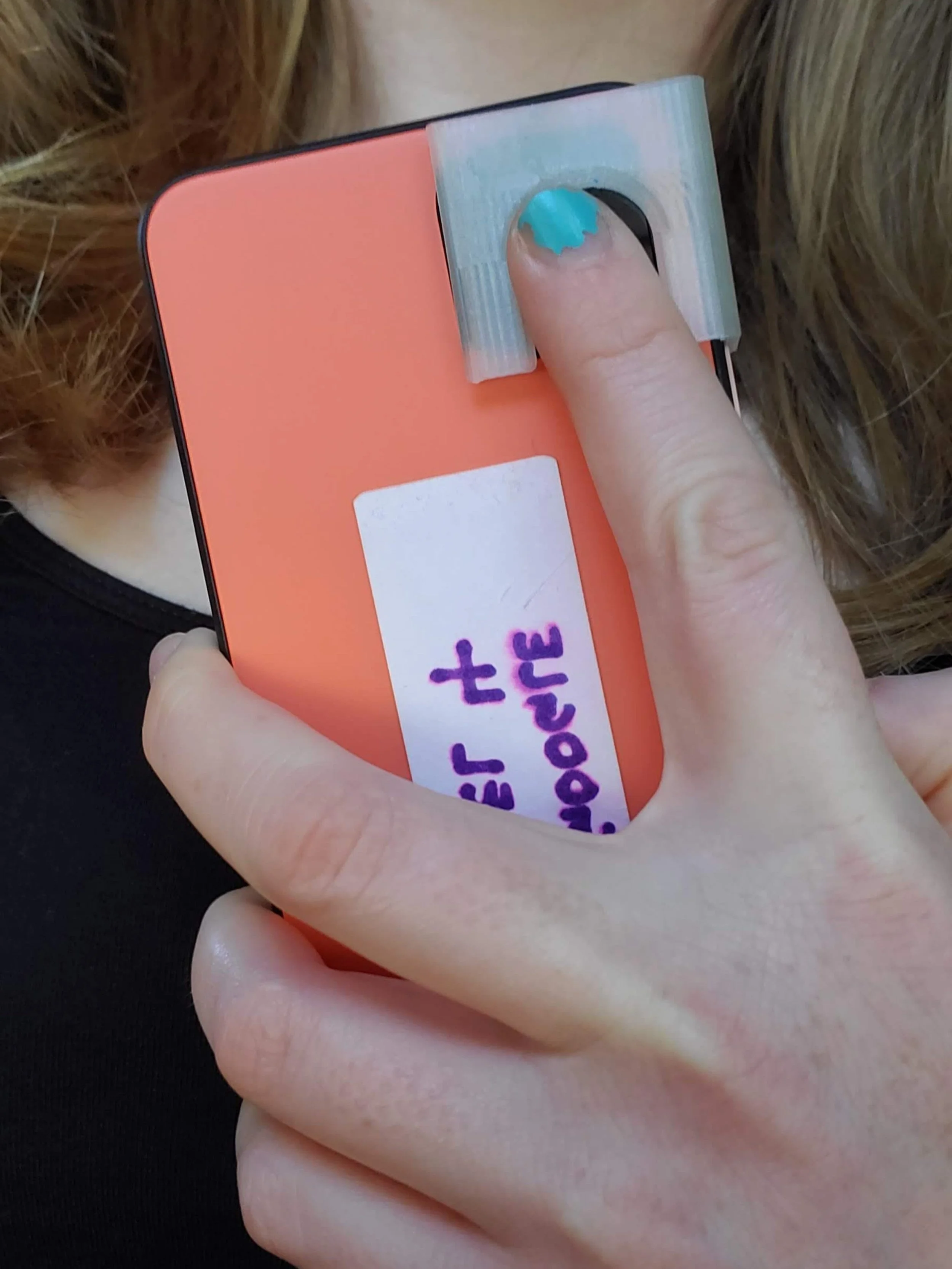
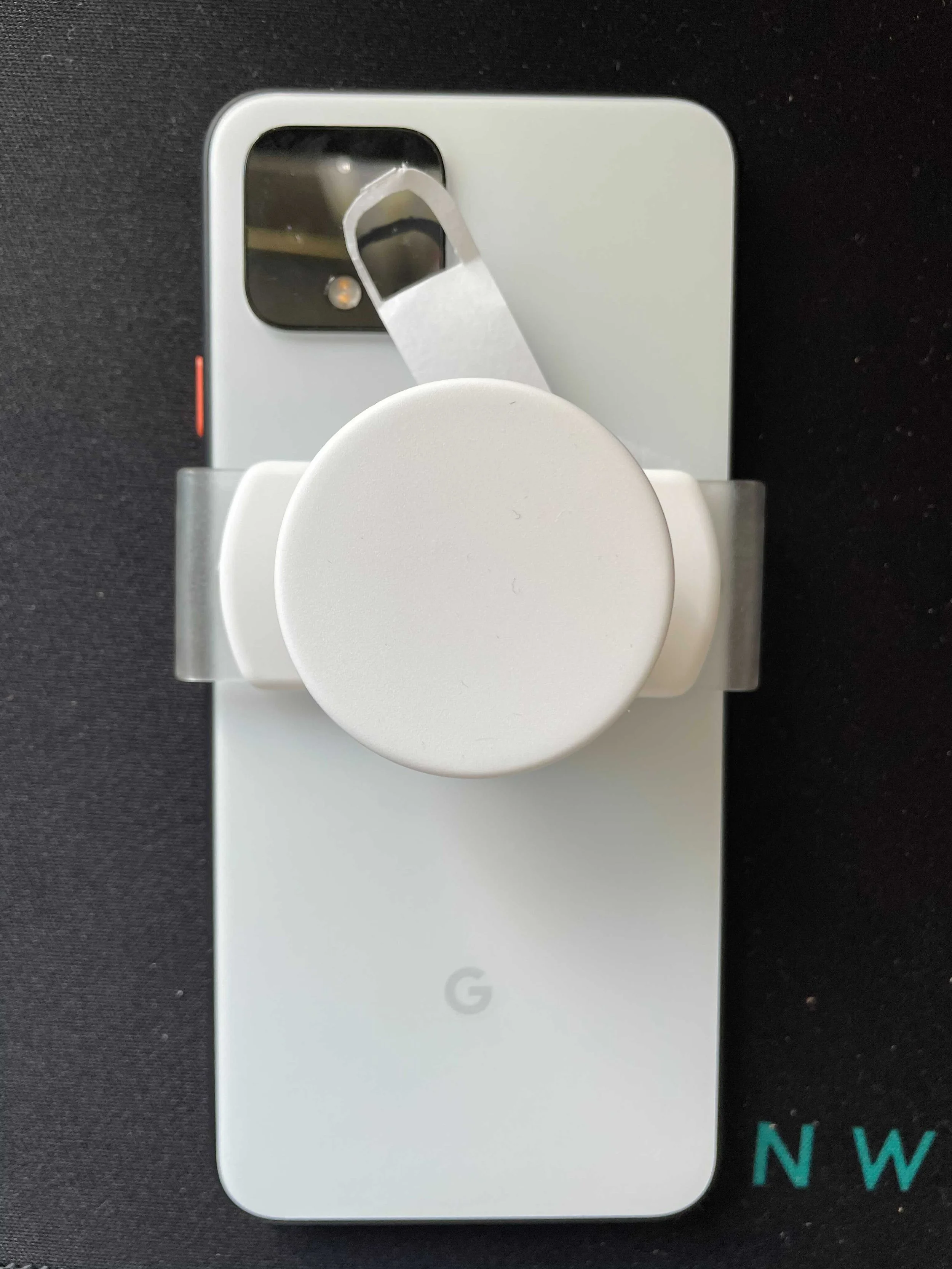
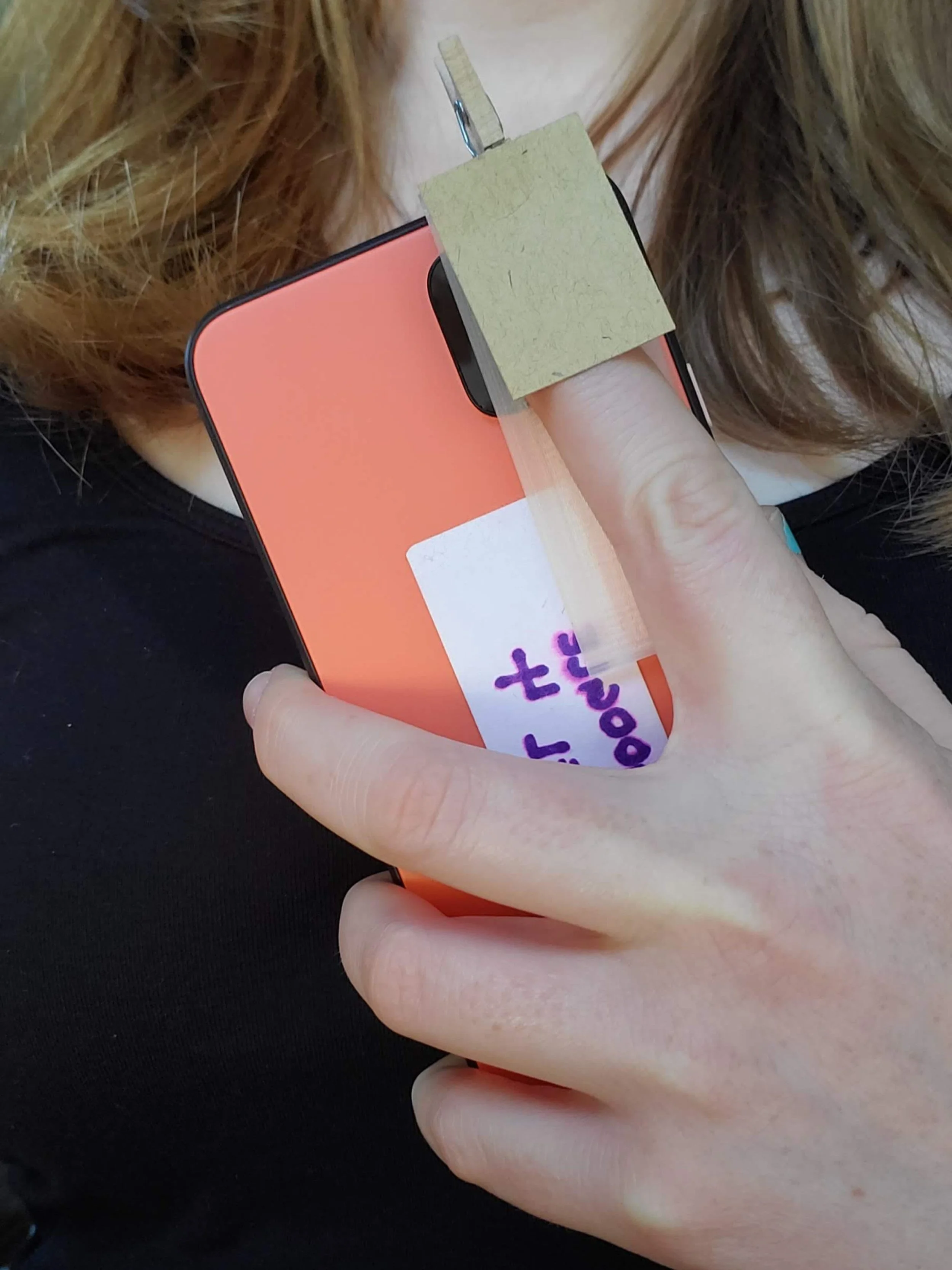
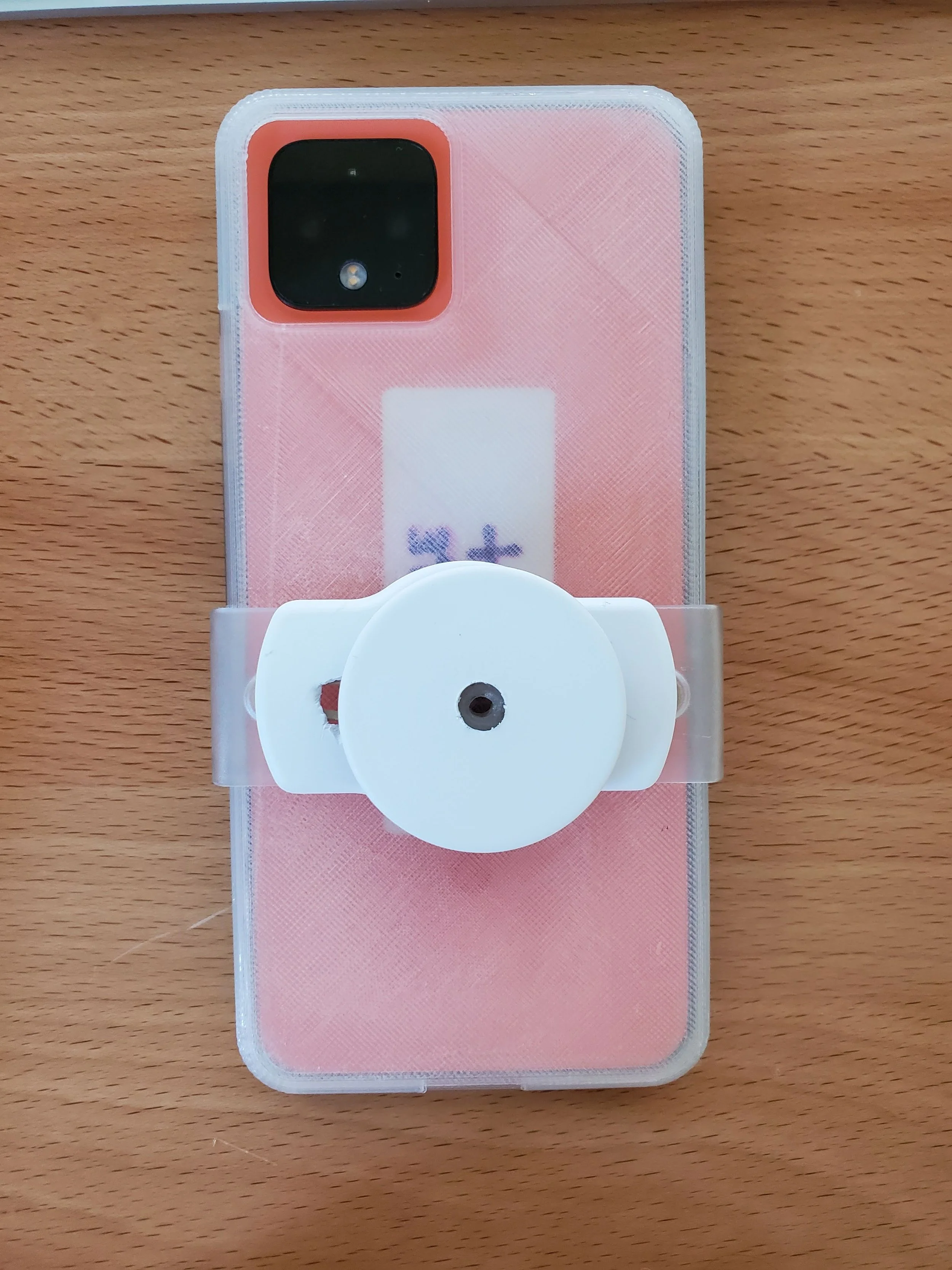
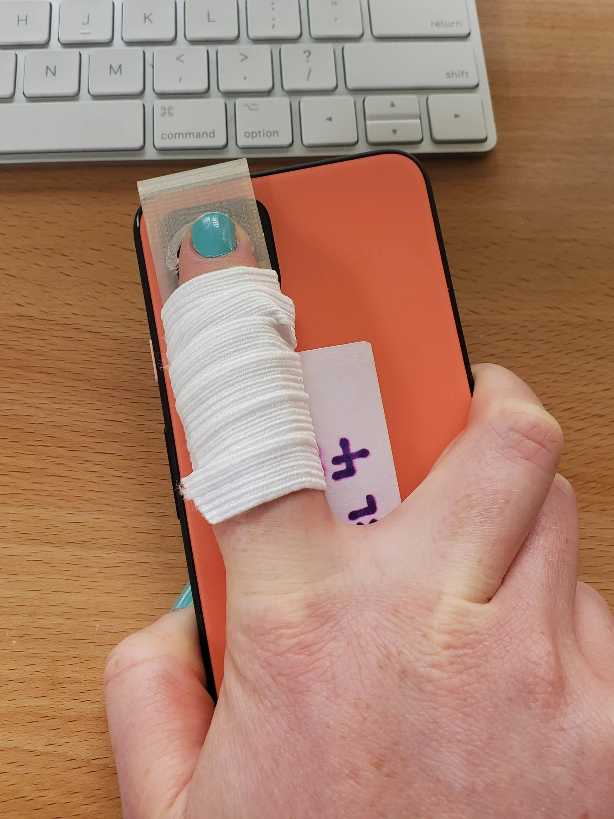
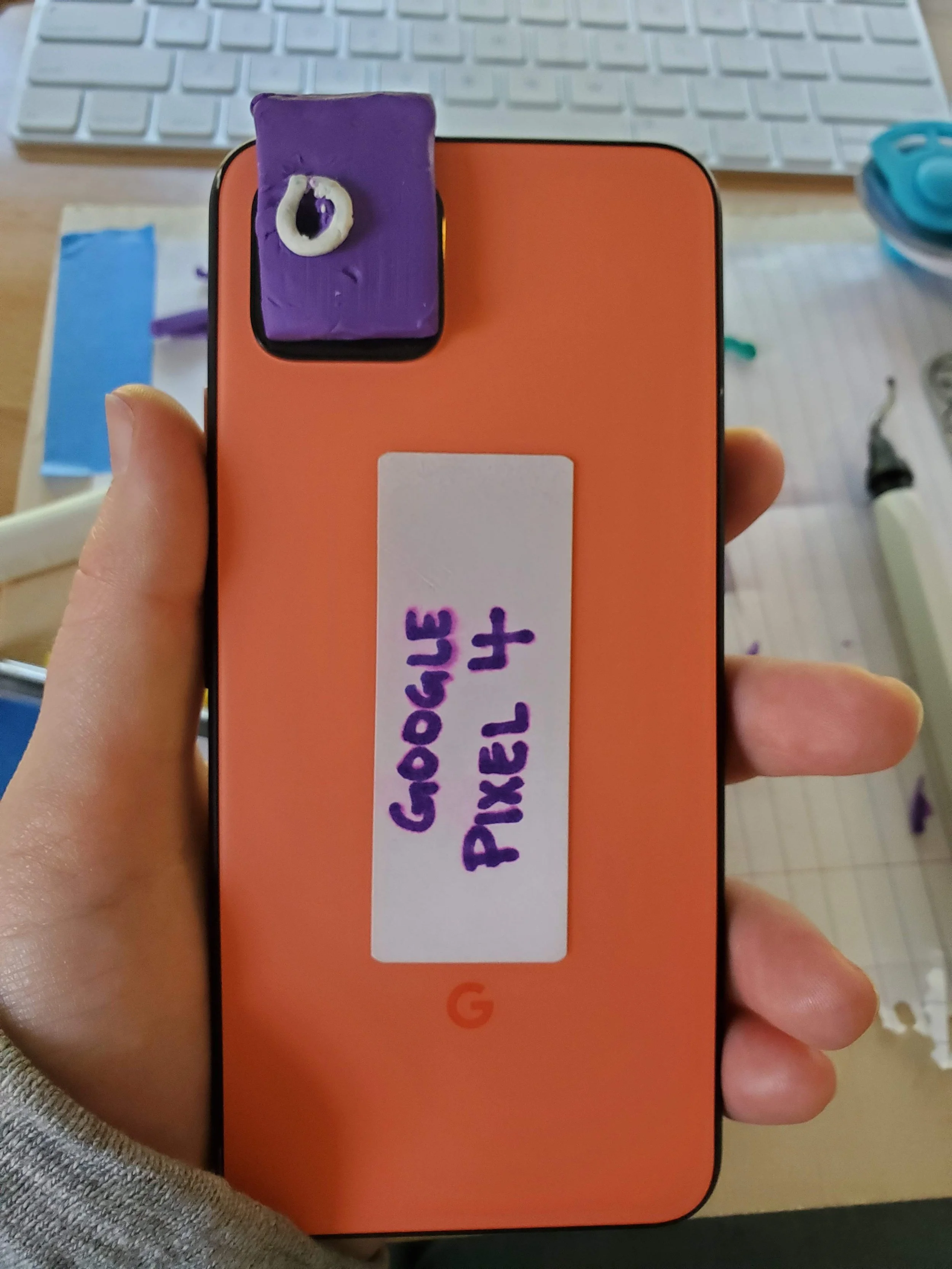
The biggest design challenge was aiding users in novel interactions with their smartphone. We used 3D printing, clay, and cardboard to rapidly iterate solutions. Above is a selection from our nearly 20 prototypes.
Selected 3D Prototypes
The prototype selected for heart rate measurement via the rear camera was a carefully designed pressure-fit clasp. This clasp securely attached to the phone at the location indicated by the user interface. It also incorporated a rear-mounted clip for stabilizing the user's finger during the measurement process. This design drew inspiration from the conventional features of pulse oximeters, a widely recognized medical device, allowing us to leverage these familiar attributes to communicate the desired interaction to the user.
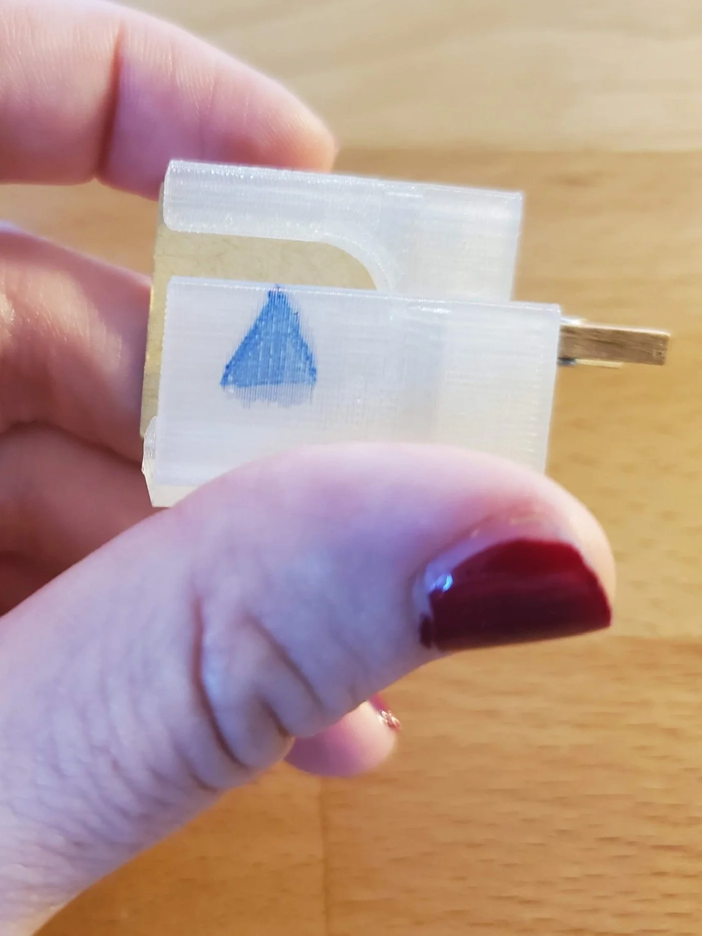
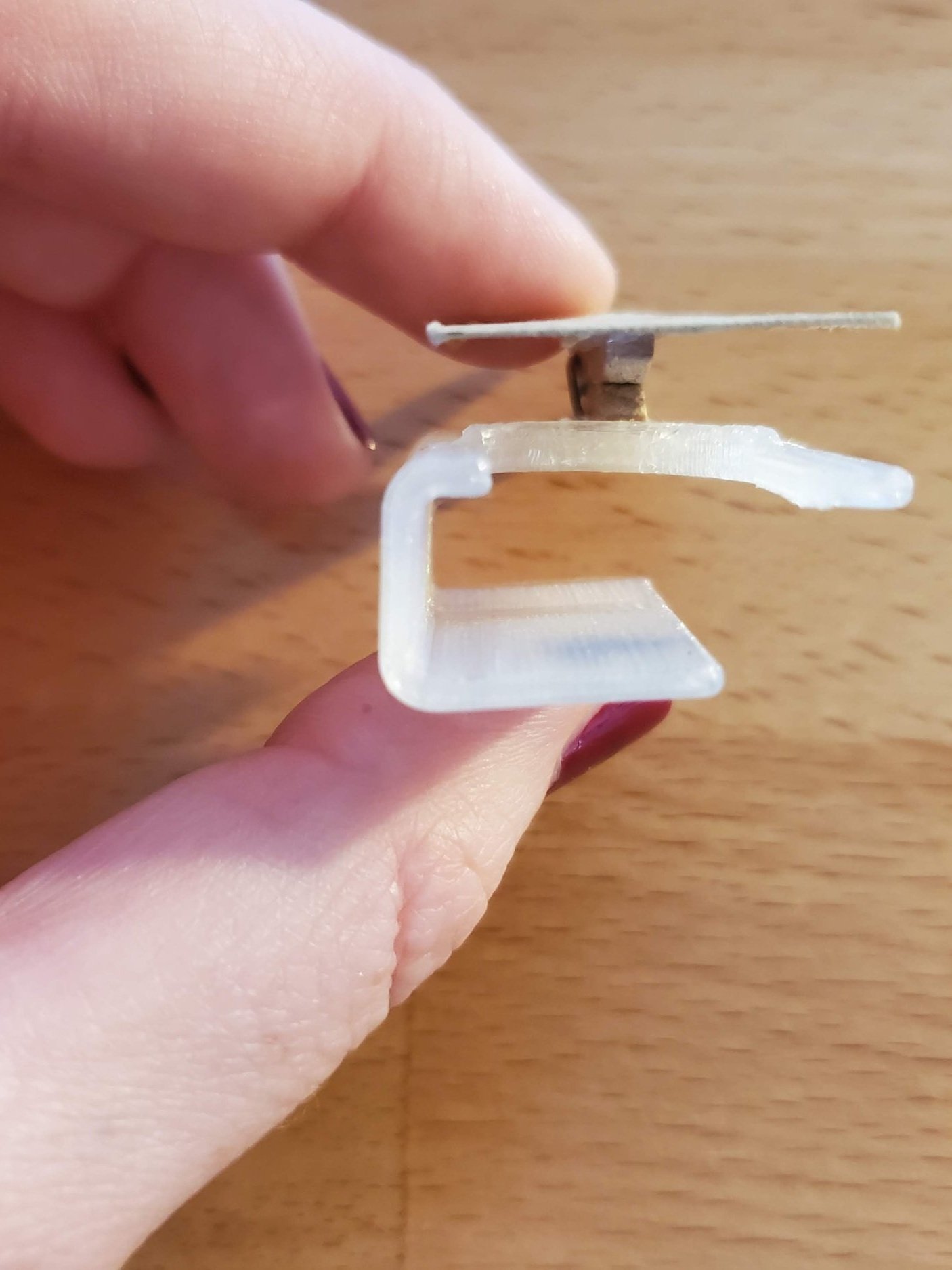
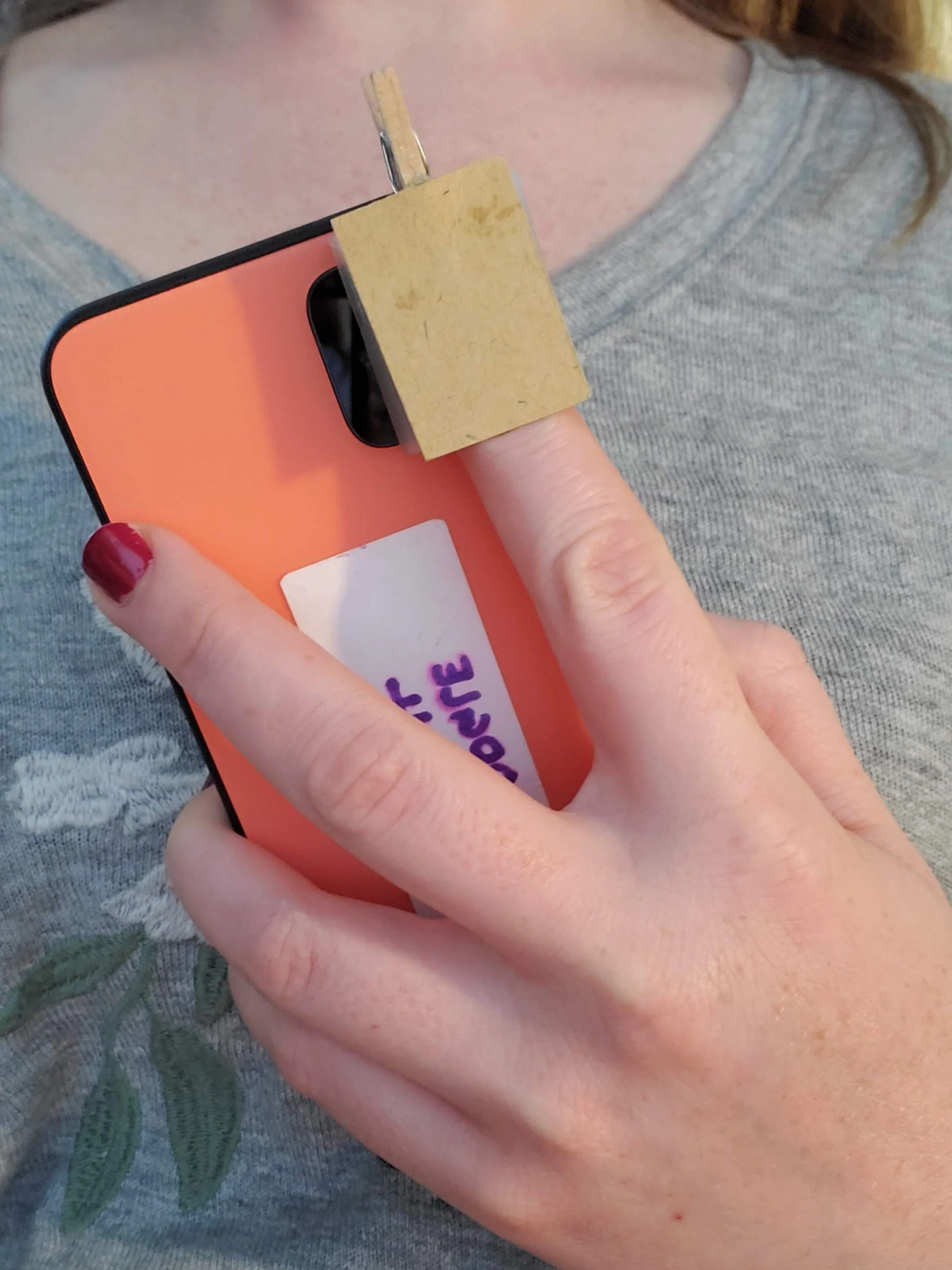
Three different views of the chosen prototype for a device that measures heart rate using the rear camera of a phone.
The final prototype for capturing breathing rate with the front camera was a readily available, commercial phone stand. Rather than reinventing an already established solution, we recognized the abundance of existing stands. Our approach was to offer this stand alongside the heart rate assistive device (above) as a comprehensive kit for telehealth patients.
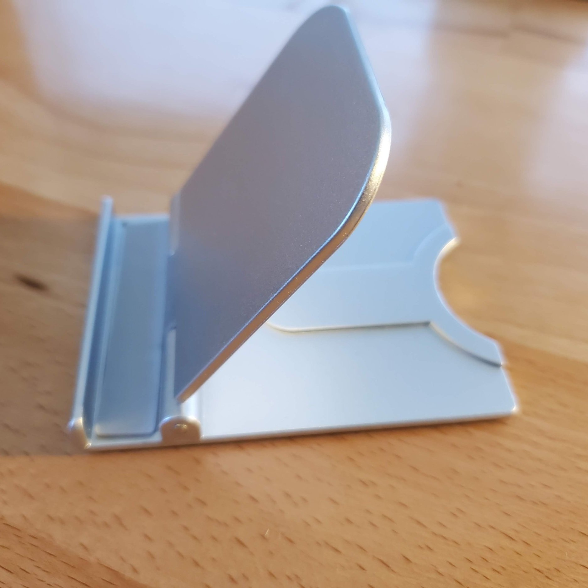
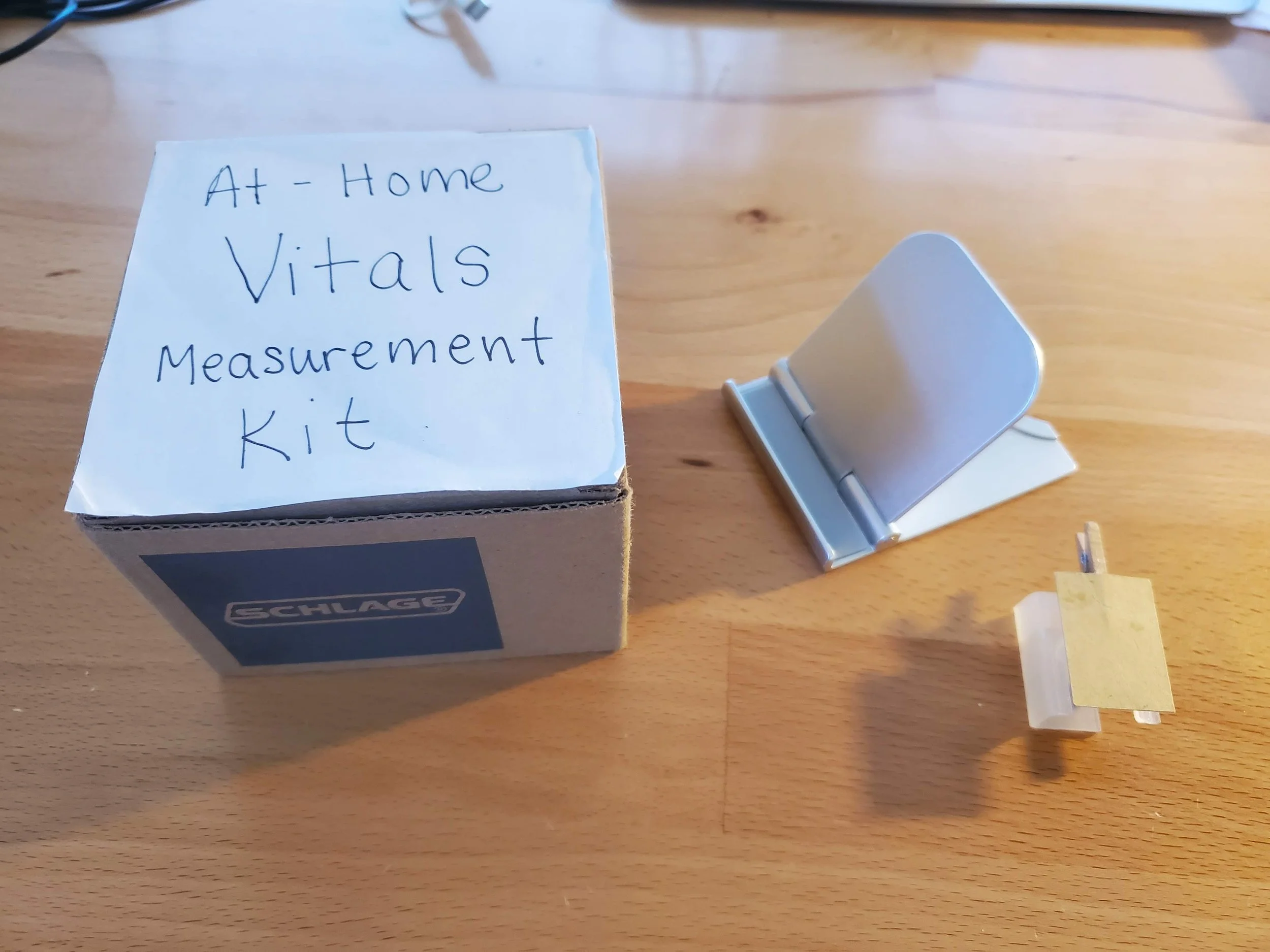
The readily available, commercial stand chosen for aiding users in measuring their breathing rate with a smartphone, and the full kit provided to users during usability tests.
Paper Prototyping
Alongside the 3D prototyping, we created paper-based screen prototypes for the smartphone's user interface. These prototypes included 2-3 instructional pages, followed by an interactive measurement page. The challenge was to maintain concise copy while ensuring a comprehensive explanation of the process. We addressed this by leveraging the interactive UI within the measurement page to guide users through the steps in real-time, allowing us to keep the instructional pages as succinct as possible.

The paper prototypes of the heart rate measurement instruction screens. Positioned above them is the assistive device prototype.
The paper prototypes of the breathing rate measurement instruction screens. Positioned above them is the assistive device prototype.
Usability Testing
Once we had our rapidly developed prototypes, we were ready to usability test some of our new ideas. While the instruction screens were made of paper, the measurement page was implemented in an interactive app. Transitioning from the paper instructions to the app presented a minor challenge during usability testing. However, we resolved this issue by introducing a warm-up phase in which users practiced the transition. Our testing involved 10 participants and followed a think-aloud protocol (available here).
The full happy path for usability testing, for both heart rate and breathing rate measurements.
Usability Findings
The usability tests revealed users' initial mental models and how they evolved after using the app. We offer insights to interaction designers of telehealth vital sign apps, highlighting that users often enter with preconceived notions influenced by clinical medical devices like pulse oximeters, consumer health tech such as smartwatches, and the smartphones they use. Leveraging these existing impressions allows for a more user-friendly UI, be it physical or digital, through the reuse of established design conventions, like the familiar shapes of medical devices.
Users’ understanding of the novel device is influence by their existing mental models of clinical medical devices, consumer health technology, and the smartphone itself.
UI elements such as the heart waveform or the progress bar help align users' mental models with the intended concept or goal.
Realistic photos in the instruction pages also helped accurately shape users’ mental model of the novel device and interaction.
Finding the right terminology for components of the phone that are not commonly mentioned in everyday conversation, e.g. '“the rear-facing camera”, is critical to users’ comprehension.
In our tests, users often arrived knowing that pulse oximeters measure heart rate from their finger, smartwatches use light to take a heart rate, and smartphone interactions occurs mainly on the front screen. So, anticipated a heart rate measurement app to work by touching the front screen with their finger. To redefine this mental model, the form factor of our clip device, reminiscent of a pulse oximeter, afforded that the measurement occurred at the back of the phone, over the camera. A familiar waveform UI element indicated when the measurement was active.

Users’ mental model of the heart rate measurement app (a) before interacting it, which is mainly shaped by existing mental models, and (c) after working it, which is shaped by the UI elements of the app.
Next Iteration
We incorporated several of the findings from our previous test into our next iteration. Using Figma, we enhanced the app prototype's resolution.


The next iteration of the heart rate app and breathing rate app. These incorporated several of the findings from the previous usability test. Click to enlarge.
We also increased the fidelity of our physical prototype for measuring heart rate. It goes further in emulating a pulse oximeter. I made the 3D design with Autodesk Fusion 360 and then 3D printed the part.
The next iteration of the heart rate app and breathing rate app was fully 3D printed. It incorporated several of the findings from the previous usability test.