Data Integration at NASA
Project type
Complex technical data, workflow diagrams, user stories
Role
Lead UX Researcher
Date
2018
Description
While working at NASA, I initiated a project to create an integrated view of several engineering databases. The project was a challenge because we were dealing with dense engineering data, a fragmented user base, and the time crunch of an upcoming launch. The project ultimately won a Group Achievement Award for an outstanding contribution to NASA’s mission, and was used in the firing room during the Artemis II launch in 2026.

The Problem
NASA engineers produce tons of data when preparing for spaceflight. One bolt on the rocket will have information saved on it from design to testing to failure analyis all the way up to launch. This data is all related to each other, but is generated by siloed teams. There was no way to look at the full story of a part through all of its data sources, which became crucial to top level engineers as the first test launch for NASA’s new human space flight mission approached.
I took the initiative to bring up this issue and propose building a team to solve it. The project was a challenge because we were dealing with dense engineering data, a fragmented user base, and the time crunch of an upcoming launch. I led a team of three that researched the several different teams that generate this data, ideated solutions to obtain an integrated view of it, and usability tested our prototypes. The resulting integrated search engine is still in use by NASA engineers today.

Each gray or blue box on this network graph is a different database containing different types of engineering data, the white boxes. Our challenge was bringing all this data into a single integrated view. Click to enlarge.
Ideation
We ideated around several different design concepts that would meet different user stories and solve breakdowns. Mainly we explored an Integrated Search, Notifications System, and Managed Lists. We also explored an App-Switcher, a menu to the left of the screen that would allow switching between databases as well as a new stand-alone integrated search.


A search concept focused on showing linked data in the results. Here it is baked into one of the existing databases, CP-Hazard.
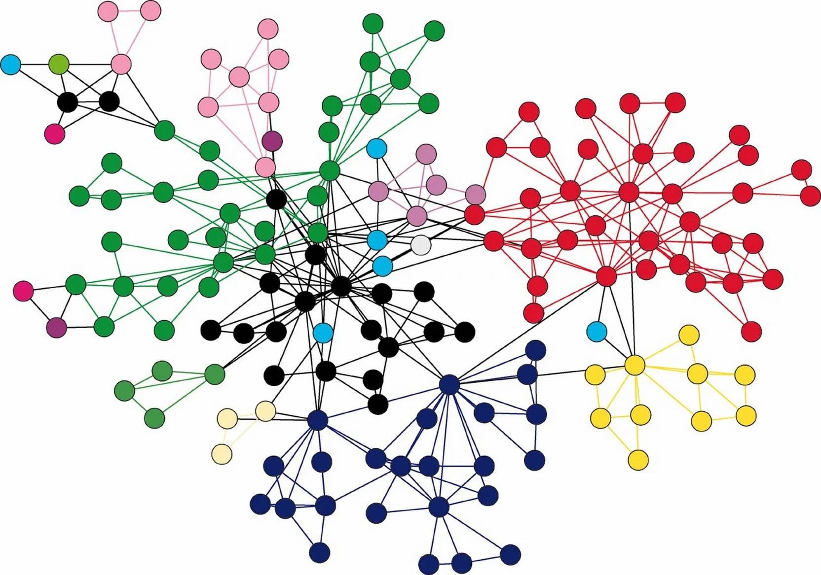
Because of my computer science and software engineering background, I was able to directly communicate with the development team and translate user needs into technical requirements. Together we chose a graph database, represented above, for the backend of our search system.
Affinity Diagram
We used affinity diagramming to analyze the data from our secondary research and interviews. The affinity diagram helped us identify common workflows, breakdowns, and user stories, detailed in the following sections.

An affinity diagram of the observations and quotes we extracted from our secondary research and interviews.
Workflows
For the teams that look across data like the test verification team, we built out workflow diagrams of how they gathered data for their reports currently. We also identified breakdowns in the process

A workflow diagram showing the data gathering process of a typical user on the test verification team. The red lightning bolts represent breakdowns, or problems, in that process. Click to enlarge.
After developing the workflow diagrams for several of these teams, we distilled them into a workflow representing the high level of what all the teams do.

A workflow diagram showing the high level data gathering process across all teams that look at integrated data.
Breakdowns
From the workflows, as well as from the interviews, we were able to identify several major process breakdowns that were common across those using integrated data.
Cross-system searches are slow
Tool fragmentation
No change notifications from linked data.
Users unable to create ad-hoc reports
Custom reports are slow to develop and difficult to maintain
Text references when there is no existing integration
Partial ID searches often don't work, need to know exact ID of item
Users unsure of available search capabilities and how to use them
User Stories and Epics
As part of our secondary research, we looked through the user stories of previous research. There were several user stories that were similar across users of different databases. Though they were working with different data from each other, they performed similar actions and had similar motivations. We generalized these user stories into broader epics. There were 8 overall, here’s a sample.
Epic 1: As the data gatherer, I want to search through data in order to determine if it is important to track.
Epic 2: As a stakeholder of a data item, I want to be notified of status updates to data linked to my item so that I can reassess risk.
Epic 3: As a data analyst on my team, I want to view data linked to mine so I can complete my analysis.
Epic 4: As the data gatherer on my team, I want to identify important items so I can refer back to them at a later date.
Search Log Analysis
Each of the databases that contain the engineering data has its own search engine. Because our team at NASA created and maintained each of these databases, we had access to the search logs for each. I analyzed the search logs to find clues as to what an integrated search engine needs to support.

We analyzed how many searches on existing databases are done via text (represented by advanced-keyword and quicksearch above) and how many are done using advanced search which has preset criteria. The majority of searches were through the preset criteria.
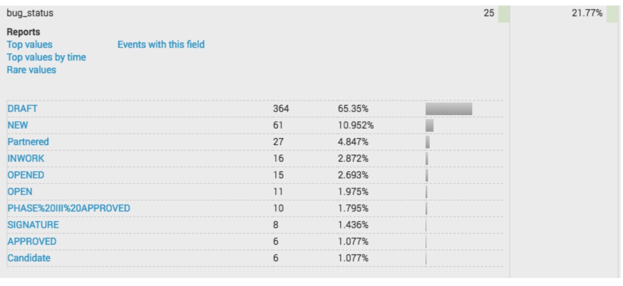
We also looked at the top search criteria that people searched for. The largest category was the status of records. Different data systems call an in-progress status different things like DRAFT, NEW, and OPEN.
Narrowing Down
Since we dealt with so much disparate data and several different engineering teams, we generated a lot of information on what our users need. The biggest challenge was deciding which data to focus on for the design phase. What was the most important problem to solve? We approached this question by taking our epics and ranking them by prevalence (how many times did we see this across all user bases) and severity (what was the severity and extent of the breakdowns associated with that epic). We took the epics closest to the top right and decided to design for those.

We narrowed down the problem by prioritizing epics (or generalized user stories) according to their prevalence and the severity of their associated breakdowns.
Contextual Interviews
We conducted interviews with teams who did integration-type work, in other words those that were looking across several data types. For example, there is a team whose job is to verify the tests and hazard analysis for specific parts. They need to look at related records across the parts database, test databases, and hazard analysis database.
“I have to create my own searches, and sometimes, using advanced search, if you don’t put in the criteria exactly right, you don’t get what you want or you get nothing.”
We ran contextual interviews where we sat with them as they showed us how they currently were conducting that search and learned more about what they need to see specifically from each database to do their integration work.
Design Decision
We decided to move forward with the stand-alone search UI concept since it most directly met users’ needs. We also decided to explore the App-Switcher concept to switch between different databases and the search UI.
Speed Dating
Because the app-switcher was a new way of thinking about the databases for our users, we first tested out the idea with “speed dating” sessions. For these sessions, we showed users several wireframes and asked for their initial reactions. Overall, the app-switching feature seemed to blend into the background (as it should) and multi-system users were grateful for a new way to search across databases.


Some of the screens from our speed-dating prototype, showing both the app-switcher (the menu on the left) and the new integrated search system.
Usability Testing
For our initial usability tests we used click through PDFs which were quick to implement out of our wireframes. Click through the app-switcher prototype here. I followed up that prototype by coding a quick version with an iframe. It was fast enough for us to keep moving but functional enough to get useful feedback from users.
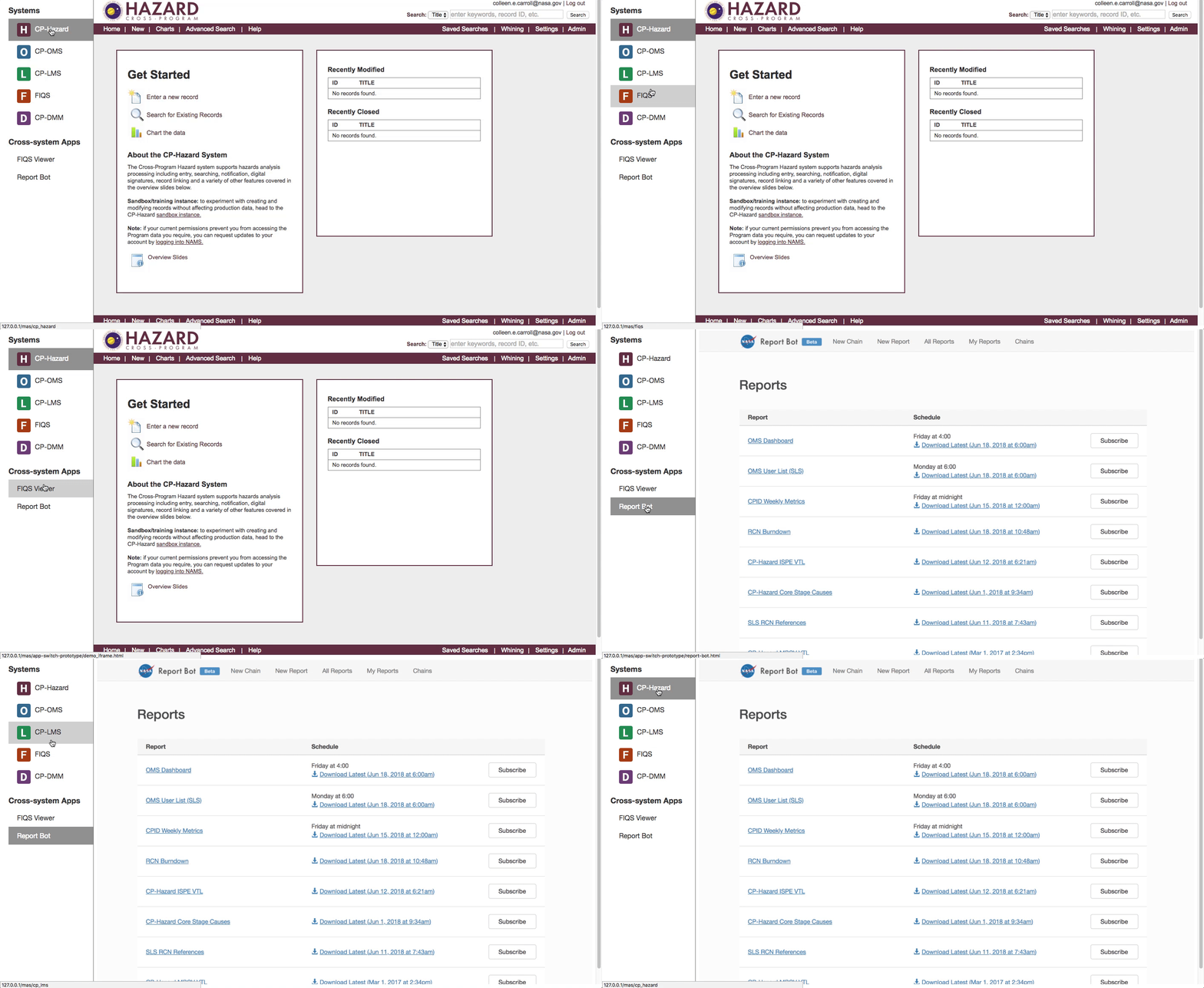
I developed a functional prototype of the app-switcher which we used for usability testing. Here it is switching between one database, CP Hazard, and a system called Report Bot.
Usability Findings
Our usability findings validated the concept of the app-switcher. It showed us that this had value and would be accepted by users. It also showed that the integrated search had an important part to play.
Opportunity for current users to be in more databases and to have less segmented data
Most people realize the databases are conceptually related
Search can help surface “gaps” if you’re aware they may exist
Single database users are fine with App Switcher
Outcomes
My research became the basis for a new integrated search engine, pictured below. The project won NASA’s Group Achievement Award for being an outstanding accomplishment that contributed substantially to NASA’s mission.
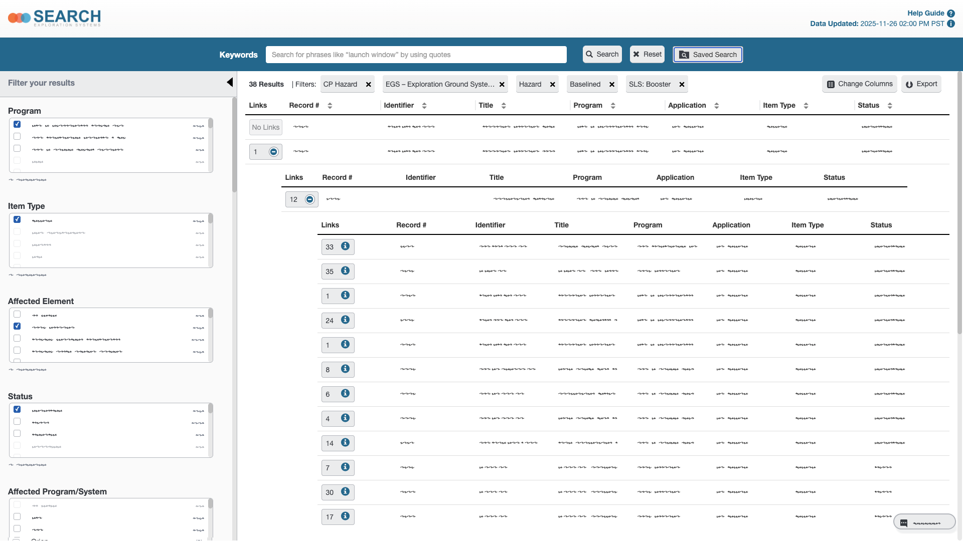
The final design of the cross-system search tool that was developed based on my research.
The final product was used in the firing room for the Artemis II launch in 2026, among other missions, and continues to be used at NASA today.
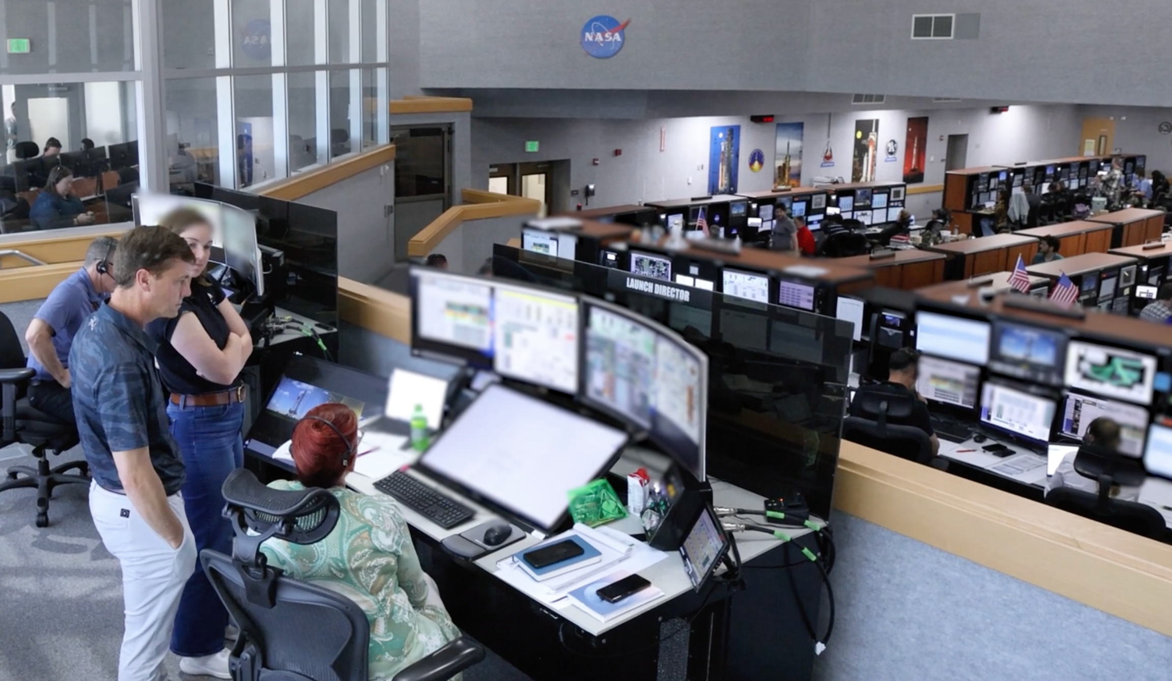
The final product in use in the firing room during NASA’s Artemis II mission.
Secondary Research
Our larger team at NASA had previously worked on each of the databases and their UIs, conducting user research with the engineering team for each one. To start the integration project, we took the data and findings of the previous research efforts, consolidated them, and conducted a meta-analysis.
“If I can’t get to the data, I just don’t bother with it.”
We had to quickly learn about several engineering disciplines—rocket design, testing, failure mode analysis, hazard analysis, verification, flight readiness, and launch requirements. While analyzing the secondary research, we were looking for themes around connecting one team’s data to another.

A wireframe of the search system and the app-switcher we decided to move forward with into the design phase.
Working with Developers
Because of my background in computer science and software engineering, I was deeply involved with the development team. I translated the user needs into technical requirements, and helped determine that we would use a graph database to store the integration information and quickly retrieve it. My involvement enabled the development team to get started on the backend in parallel with the UI design.

Managed Lists was a concept that would allow users to save lists of linked data from across different databases.
The App Switcher is a menu that would show up to the left of each of the individual databases, enabling a user to switch between each database they were subscribed to, the new search page, and other cross-system apps.

The Notifications concept would send email notifications to users when something linked to their data changed. We made a mockup using the existing email template from our databases.

