Pathfinding in the International Space Station
Project type
Augmented reality (AR), lo-fi prototyping, AR prototyping
Role
Lead UX Designer
Date
2016
Overview
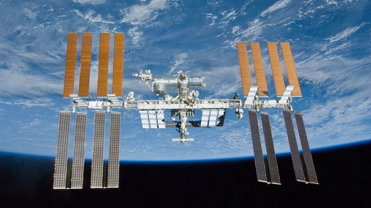
Astronauts on the international space station need to locate various tools for running experiments and performing station maintenance. The tools are spread out across the space station and often move. We created an augmented reality, just-in-time training app for new astronauts to find their way around the station and locate tools. Because the astronauts experience zero gravity, direction words are rendered meaningless, so we needed another way to direct them. The work from our prototypes was published HCI International 2017.
The Problem
New astronauts joining the International Space Station (ISS) crew spend days training on how to get around the station. Even once they have learned, sometimes a tool has been moved and isn’t where it is expected to be. Astronaut time is very expensive, about $130,000 an hour. So any time wasted looking for things on the ISS adds up quickly. We wanted to create a just-in-time training tool for astronauts to help astronauts with pathfinding in the ISS. This would eliminate the need for days of pre-training and would help them find things even when they aren’t where they’re expected to be.
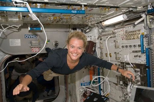
New crew members need training to get around the International Space Station (ISS). We set out to provide just-in-time training and pathfinding for astronauts.
The Challenge: Pathfinding in 0g
Astronauts do not experience the feeling of gravity while on the ISS. They are able to float through the sections of the ISS, and can access all walls of the station because they don’t need to stand. There is no floor or ceiling. In fact, there is no sense of up or down in zero gravity. Depending how someone is oriented in a section of the ISS, their left could be a system’s right and their right could be the system’s left. So we couldn’t use traditional voice cues like “turn left” as part of our pathfinding system. We had to explore alternative methods. Our eventual designs landed on augmented reality visual cues, either a long line or floating arrows guiding to the right place.
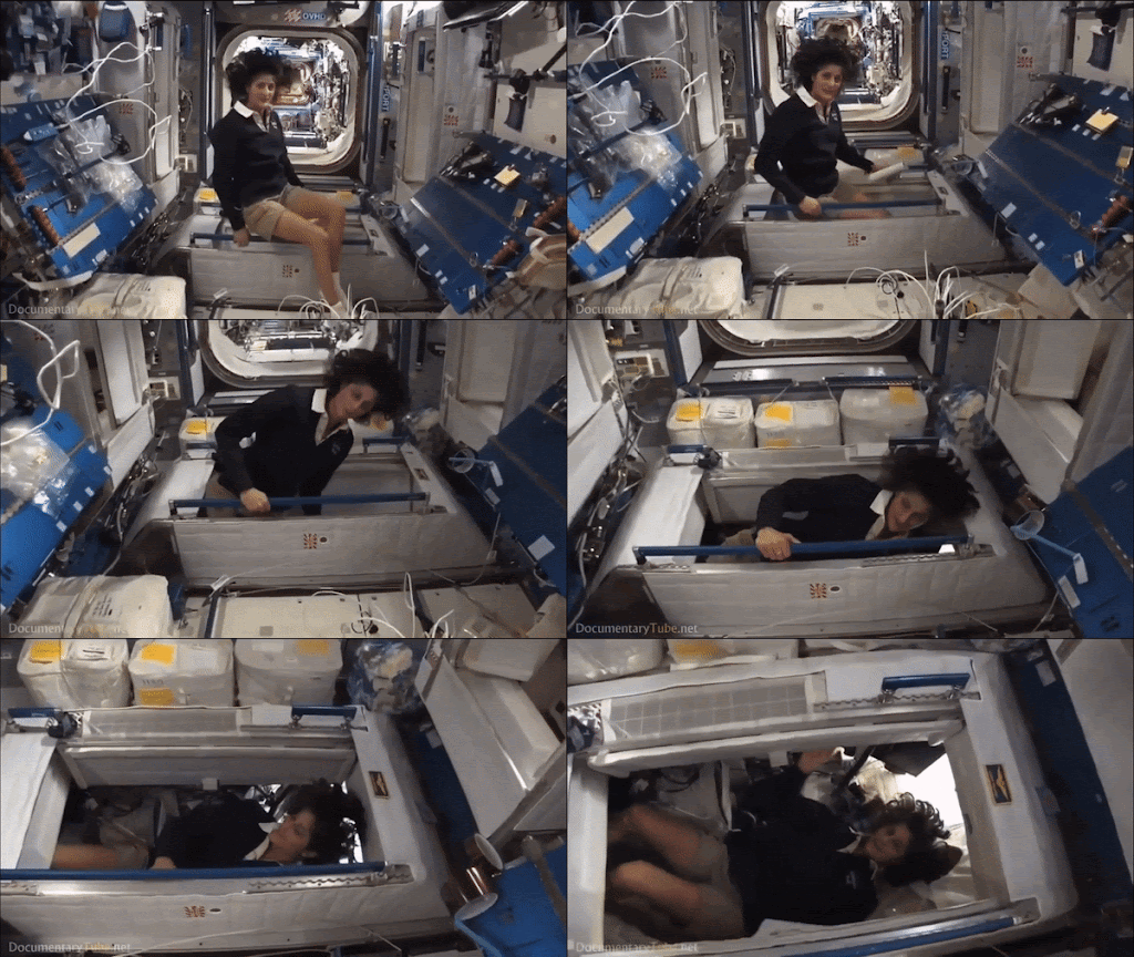
Astronauts experience zero gravity, where there is no definitive up, down, left, or right. Because of this our pathfinding system had to rely on non-verbal cues.
Brainstorming
We focused in on the use case of needing to find a tool to complete a procedure (such as to run an experiement or fix something). Then we ran a group brainstorm for the pathfinding solution. We were completely open to any technology or interaction types. I created prompts and everyone on the team, including the engineering team, drew or wrote ideas down on post-it notes. Then we shared them with the group.
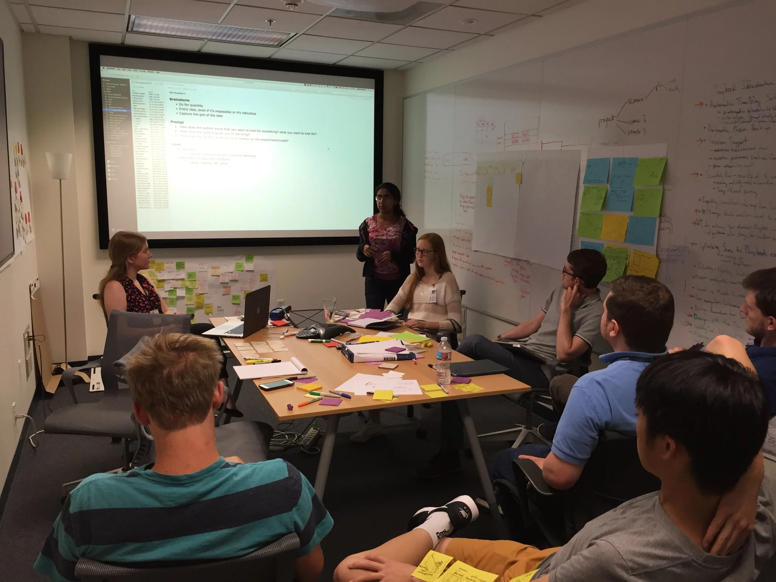
We brainstormed ideas on how to help an astronaut find a path to a tool they need for a procedure. I presented prompts and the whole team, including engineering, participated.
Promising Ideas
We distilled our ideas into a few interaction options for each stage of the pathfinding. There were five stages to a happy path: Start the system and indicated what to find, Guide the user to the general location of the item, point out the Precise Location of the item, give Feedback on Success, Return to the user’s original location.
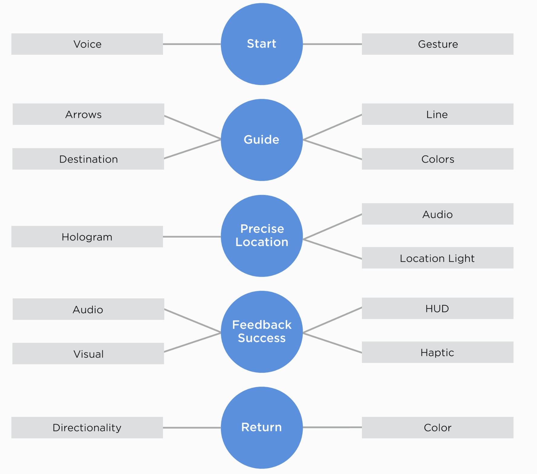
We split the task of pathfinding into 5 stages, and brainstormed possible interaction types for each one.
Storyboarding
To test the different interaction types even further, we did some storyboarding to flesh out the top ideas from the brainstorm. From this we decided to go with an augmented reality-based design.

A storyboard exploring using augmented reality arrows to guide astronuats to the correct item.
Another Challenge: Rapid Prototyping for AR
Rather than immediately move to coding a solution, we wanted to first prototype and test out our ideas with users. We wanted to make the prototype as rapidly as possible, meaning we wanted to stay as low-fidelity as we could while still replicating the intended experience closely enough that users’ responses would be meaningful. With augmented reality (AR), such a high tech medium, it wasn’t obvious how to do this.
We wanted to test an experience with floating menus and a bright AR line that guides the user to the tool they’ve selected. We were able to do this by creating large poster boards with the screens of the floating menus and then tacking them to the wall. Employing the Wizard of Oz technique, a designer would change the screens according to the options the user chose. The guide line was made using brightly colored masking tape, stuck to the walls and floors. Our simulated space station was the halls of an office building. We also had users wear the Hololens headset while completing usability test to keep that part of the prototype experience consistent with the intended experience. The whole thing took about an hour to prototype, well within our rapid prototyping goal.
The view from the Hololens, an AR headset, as a user runs through part of a usability test with our paper AR prototype.
Usability Testing 1: A Unique Warm Up
Another challenge to this project was making sure our users were already familiar with the augmented reality gestures and headset, since an astronaut using our system would already be familiar with them. We also needed to familiarize users with the simulated AR experience of having UI features tacked to the wall, as well as the Wizard of Oz concept. To accomplish all of this, we designed a warmup that ran users through a music player, a relatively familiar type of UI now in the circumstances of simulated AR. This warmup gave the users a chance to adjust to all aspects of our prototype without that adjustment interfering with the test itself.

Left: The paper prototype of an AR music player. Right: The view from the Hololens headset as a designer changes the screen and the user makes a gesture selection.
Usability Test Findings 1
The paper AR prototype proved successful in generating useful feedback. Here are the top findings of our usability test.
Many users said they preferred using voice over hand gesture but during user tests participants tended to use both.
A single line on the floor leading to a tools exact location was a successful method of marking the destination.
Visual feedback after task completion was needed after the user found each tool to ensure they were on the right path.
Usability Testing 2: AR Prototype
For our second round of usability testing, we added actual augmented reality UI elements. The elements were still fairly minimal and some paper still existed as part of the prototype. It was effectively a wireframe for AR. We also tested a slightly different guidance system, this time using arrows instead of lines.
The view from the Hololens as a user ran through our second usability test, this time using hologram arrows instead of guide lines.
Usability Test Findings 2
Here are the top findings of our second round of usability tests. Though the arrows were successful in guiding users, some users felt they were excessive.
Using calculated arrow spacing along side a linear path gave users an easy guidance system to locate their desired tool.
Some users felt that they didn’t need such an excessive guidance system which at times could feel unnecessary.
Placing a hovering hologram over tools precise location proved to be a successful device to mark the destination.
Outcomes
The findings of our usability studies were published at the HCI International 2017 conference.